2017
So far the easiest way to install Python is via Anaconda, which also install many useful modules.
2017
So far the easiest way to install Python is via Anaconda, which also install many useful modules.
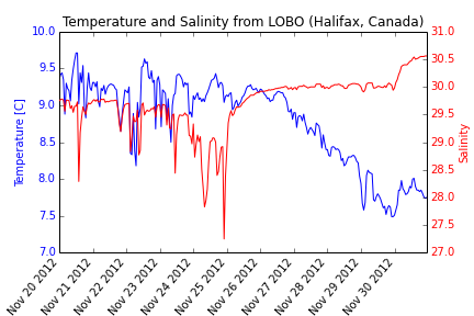
Here we will make a plot using 2 different dependent variables with different scales. Satlantic LOBO is a ocean observatory moored in the North West Arm (Halifax, Nova Scotia, Canada). In this post, we’ll query the LOBO server to create a temperature and salinity plot.
import urllib2
import StringIO
import csv
import matplotlib.pyplot as plt

#define start and end dates
startdate = '20121120'
enddate = '20121130'

# Read data from LOBO
response = urllib2.urlopen('http://lobo.satlantic.com/cgi-data/nph-data.cgi?min_date='
+startdate+'&max_date='+enddate+'&y=salinity,temperature')
data = response.read()

# We use StringIO to convert data into a StringIO object
# Learn more: http://docs.python.org/2/library/stringio.html
data = StringIO.StringIO(data)

# read the StringIO object as it was a file
r = csv.DictReader(data,
dialect=csv.Sniffer().sniff(data.read(1000)))
data.seek(0)

# Put the values into x, y1, and y2.
date= []
temp= []
salt= []
for row in r:
    date.append(row['date [AST]'])
    temp.append(row['temperature [C]'])
    salt.append(row['salinity'])

# Change the time strings into datetime objects
from datetime import datetime
DAT = []

for row in date:
    DAT.append(datetime.strptime(row,"%Y-%m-%d %H:%M:%S"))

#create figure
fig, ax =plt.subplots(1)
# Plot y1 vs x in blue on the left vertical axis.
plt.xlabel("Date [AST]")
plt.ylabel("Temperature [C]", color="b")
plt.tick_params(axis="y", labelcolor="b")
plt.plot(DAT, temp, "b-", linewidth=1)
plt.title("Temperature and Salinity from LOBO (Halifax, Canada)")
fig.autofmt_xdate(rotation=50)

# Plot y2 vs x in red on the right vertical axis.
plt.twinx()
plt.ylabel("Salinity", color="r")
plt.tick_params(axis="y", labelcolor="r")
plt.plot(DAT, salt, "r-", linewidth=1)

plt.show()
#To save your graph
plt.savefig('saltandtemp.png')
Here we plot surface currents from the Satlantic LOBO ocean observatory moored in the North West Arm (Halifax, Nova Scotia, Canada). We used a 1D quiver plot… often used to represent magnitude and direction of currents at a particular location.

import urllib2
import StringIO
import csv
import numpy as np
from datetime import datetime
import matplotlib.pyplot as plt

startdate = '20070518'
enddate   = '20070530'

# Read data from LOBO buoy
response = urllib2.urlopen('http://lobo.satlantic.com/cgi-data/nph-data.cgi?min_date='
                           +startdate+'&max_date='+enddate+'&y=current_across1,current_along1')
data = StringIO.StringIO(response.read())
r = csv.DictReader(data,dialect=csv.Sniffer().sniff(data.read(1000)))
data.seek(0)

# Break file into three lists
date, u, v = [],[],[]
for row in r:
    date.append(row['date [AST]'])
    u.append(row['current across channel [m/s]'])
    v.append(row['current along channel [m/s]'])

# Change the time strings into datetime objects
# ...and calculate 'decday' (i.e. "days from start")
datestart = datetime.strptime(date[1],"%Y-%m-%d %H:%M:%S")
DATE,decday = [],[]
for row in date:
    daterow = datetime.strptime(row,"%Y-%m-%d %H:%M:%S")
    DATE.append(daterow)
    decday.append((daterow-datestart).total_seconds()/(3600*24))

# Convert lists to numpy arrays
u = np.array(u, dtype=float)
v = np.array(v, dtype=float)

# Plot the output ************************************************************
# Plot quiver
fig1, (ax1, ax2) = plt.subplots(2,1)
magnitude = (u**2 + v**2)**0.5
maxmag = max(magnitude)
ax1.set_ylim(-maxmag, maxmag)
fill1 = ax1.fill_between(decday, magnitude, 0, color='k', alpha=0.1)

# Fake 'box' to be able to insert a legend for 'Magnitude'
p = ax1.add_patch(plt.Rectangle((1,1),1,1,fc='k',alpha=0.1))
leg1 = ax1.legend([p], ["Current magnitude [m/s]"],loc='lower right')
leg1._drawFrame=False

# 1D Quiver plot
q = ax1.quiver(decday,0,u,v,
               color='r',
               units='y',
               scale_units='y',
               scale = 1,
               headlength=1,
               headaxislength=1,
               width=0.004,
               alpha=0.5)
qk = plt.quiverkey(q,0.2, 0.05, 0.2,
               r'$0.2 \frac{m}{s}$',
               labelpos='W',
               fontproperties={'weight': 'bold'})

# Plot u and v components
ax1.axes.get_xaxis().set_visible(False)
ax1.set_xlim(0,max(decday)+0.5)
ax1.set_title("Current velocity from LOBO (Halifax, Canada)")
ax1.set_ylabel("Velocity (m/s)")
ax2.plot(decday, v, 'b-')
ax2.plot(decday, u, 'g-')
ax2.set_xlim(0,max(decday)+0.5)
ax2.set_xlabel("Days from start")
ax2.set_ylabel("Velocity (m/s)")
# Set legend location - See: http://matplotlib.org/users/legend_guide.html#legend-location
leg2 = plt.legend(['v','u'],loc='upper left')
leg2._drawFrame=False
plt.show()

# Save figure (without 'white' borders)
plt.savefig('1D_quiver.png', bbox_inches='tight')
One more post about the OTN Gliders… Previous OTN glider posts include:
Below we use data from the OTN Ocean Glider Programme. We utilize the SCITOOLS Python Library for Scientific Computing to create the animated gif.
NOTE: Click on the image below to play the animation

CLICK on Image to play the ANIMATION
import csv
import numpy as np
import urllib2
import StringIO
import pickle
import scitools.easyviz as scit
from matplotlib.transforms import Bbox, TransformedBbox, \
     blended_transform_factory
from mpl_toolkits.axes_grid1.inset_locator import BboxPatch, BboxConnector,\
     BboxConnectorPatch
import matplotlib.pyplot as plt

# Open file
response = urllib2.urlopen('http://glider.ceotr.ca/data/live/sci_water_temp_live.csv')
data = response.read()
data = StringIO.StringIO(data)

# Read file
r = csv.DictReader(data)

# Initialize empty variables
date, lat, lon, depth, temp = [],[],[],[],[]

# Loop to parse data into our variables
for row in r:
    date.append(float(row['unixtime']))
    lat.append(float(row['lat']))
    lon.append(float(row['lon']))
    depth.append(float(row['depth']))
    temp.append(float(row['sci_water_temp']))

# Estimate "distance along transect *******************************************

# First, design a function to estimate great-circle distance
def distance(origin, destination):
    #Source: http://www.platoscave.net/blog/2009/oct/5/calculate-distance-latitude-longitude-python/
    import math
    lat1, lon1 = origin
    lat2, lon2 = destination
    radius = 6371 # km

    dlat = math.radians(lat2-lat1)
    dlon = math.radians(lon2-lon1)
    a = math.sin(dlat/2) * math.sin(dlat/2) + math.cos(math.radians(lat1)) \
        * math.cos(math.radians(lat2)) * math.sin(dlon/2) * math.sin(dlon/2)
    c = 2 * math.atan2(math.sqrt(a), math.sqrt(1-a))
    d = radius * c

    return d

# Compute distance along transect
dist = np.zeros((np.size(lon)))
for i in range(2,np.size(lon)):
    dist[i] = dist[i-1] + distance([lat[i-1], lon[i-1]], [lat[i], lon[i]])

# Estimate bathymetry **********************************************************
# Load bathymetry file created here: https://oceanpython.org/2013/03/21/bathymetry-topography-srtm30/
T = pickle.load(open('/home/diego/PythonTutorials/SRTM30/topo.p','rb'))

# Compute bathymetry
bathy = np.zeros((np.size(lon)))
for i in range(np.size(lon)):
    cost_func = ((T['lons']-lon[i])**2) + ((T['lats']-lat[i])**2)
    xmin, ymin = np.unravel_index(cost_func.argmin(), cost_func.shape)
    bathy[i] = -T['topo'][xmin, ymin]

# Fuctions for zoom effect ****************************************************
# Source: http://matplotlib.org/dev/users/annotations_guide.html#zoom-effect-between-axes
def connect_bbox(bbox1, bbox2,
                 loc1a, loc2a, loc1b, loc2b,
                 prop_lines, prop_patches=None):
    if prop_patches is None:
        prop_patches = prop_lines.copy()
        prop_patches["alpha"] = prop_patches.get("alpha", 1)*0.2

    c1 = BboxConnector(bbox1, bbox2, loc1=loc1a, loc2=loc2a, **prop_lines)
    c1.set_clip_on(False)
    c2 = BboxConnector(bbox1, bbox2, loc1=loc1b, loc2=loc2b, **prop_lines)
    c2.set_clip_on(False)

    bbox_patch1 = BboxPatch(bbox1, **prop_patches)
    bbox_patch2 = BboxPatch(bbox2, **prop_patches)

    p = BboxConnectorPatch(bbox1, bbox2,
                           #loc1a=3, loc2a=2, loc1b=4, loc2b=1,
                           loc1a=loc1a, loc2a=loc2a, loc1b=loc1b, loc2b=loc2b,
                           **prop_patches)
    p.set_clip_on(False)

    return c1, c2, bbox_patch1, bbox_patch2, p

def zoom_effect(ax1, ax2, xmin, xmax, **kwargs):
    """
    ax1 : the main axes
    ax1 : the zoomed axes
    (xmin,xmax) : the limits of the colored area in both plot axes.

    connect ax1 & ax2. The x-range of (xmin, xmax) in both axes will
    be marked.  The keywords parameters will be used ti create
    patches.

    Source: http://matplotlib.org/dev/users/annotations_guide.html#zoom-effect-between-axes

    """

    trans1 = blended_transform_factory(ax1.transData, ax1.transAxes)
    trans2 = blended_transform_factory(ax2.transData, ax2.transAxes)

    bbox = Bbox.from_extents(xmin, 0, xmax, 1)

    mybbox1 = TransformedBbox(bbox, trans1)
    mybbox2 = TransformedBbox(bbox, trans2)

    prop_patches=kwargs.copy()
    prop_patches["ec"]="r"
    prop_patches["alpha"]=None
    prop_patches["facecolor"]='none'
    prop_patches["linewidth"]=2

    c1, c2, bbox_patch1, bbox_patch2, p = \
        connect_bbox(mybbox1, mybbox2,
                     loc1a=3, loc2a=2, loc1b=4, loc2b=1,
                     prop_lines=kwargs, prop_patches=prop_patches)

    ax1.add_patch(bbox_patch1)
    ax2.add_patch(bbox_patch2)
    ax2.add_patch(c1)
    ax2.add_patch(c2)
    ax2.add_patch(p)

    return c1, c2, bbox_patch1, bbox_patch2, p

# Make plots
nframes = 20
overlap = 0.95
window = np.floor(max(dist)-min(dist)) / (nframes - (nframes*overlap) + overlap)

xmin = 0
xmax = xmin + window
fig1 = plt.figure()
for i in range(0,nframes):
    ax1 = plt.subplot(211)
    plt.fill_between(dist,bathy,1000,color='k')
    plt.scatter(dist,depth,s=15,c=temp,marker='o', edgecolor='none')
    plt.ylim((-0.5,max(depth)+5))
    ax1.set_ylim(ax1.get_ylim()[::-1])
    cbar = plt.colorbar(orientation='vertical', extend='both')
    cbar.ax.set_ylabel('Temperature ($^\circ$C)')
    plt.title('OTN Glider transect')
    plt.ylabel('Depth (m)')
    ax1.set_xlim(min(dist),max(dist))

    ax2 = plt.subplot(212)
    plt.fill_between(dist,bathy,1000,color='k')
    plt.scatter(dist,depth,s=15,c=temp,marker='o', edgecolor='none')
    plt.ylim((-0.5,max(depth)+5))
    ax2.set_ylim(ax2.get_ylim()[::-1])
    plt.ylabel('Depth (m)')
    plt.xlabel('Distance along transect (km)')
    ax2.set_xlim(xmin,xmax)
    zoom_effect(ax1, ax2,xmin,xmax)

    # Save figure (without 'white' borders)
    if i < 10:
        plt.savefig('glider_0'+str(i)+'.png', bbox_inches='tight')
    else:
        plt.savefig('glider_'+str(i)+'.png', bbox_inches='tight')

    plt.close()

    xmin = xmax - np.floor(window*overlap)
    xmax = xmin + window

# Make animated gif
scit.movie('glider_*.png',encoder='convert',output_file='glider_movie.gif',fps=4)
Gliders are Autonomous Underwater Vehicles that carry several oceanographic instruments and allow unmanned ocean sampling. Below we use data from the OTN Ocean Glider Programme. Here we present “more advanced” code. We also showed a very basic plotting code HERE.


import csv
import numpy as np
import matplotlib.pyplot as plt
import datetime
import urllib2
import StringIO
import pickle

# Open file

response = urllib2.urlopen('http://glider.ceotr.ca/data/live/sci_water_temp_live.csv')

data = response.read()
data = StringIO.StringIO(data)
# Read file
r = csv.DictReader(data)

# Initialize empty variables
date, lat, lon, depth, temp = [],[],[],[],[]

# Loop to parse data into our variables
for row in r:
    date.append(float(row['unixtime']))
    lat.append(float(row['lat']))
    lon.append(float(row['lon']))
    depth.append(float(row['depth']))
    temp.append(float(row['sci_water_temp']))

# Change unix-time into a date object (for easier plotting)
DATE = []
for row in date:
    DATE.append(datetime.datetime.fromtimestamp(row))

# Estimate "distance to shore" and "distance along transect ********************

# First, design a function to estimate great-circle distance
def distance(origin, destination):
    #Source: http://www.platoscave.net/blog/2009/oct/5/calculate-distance-latitude-longitude-python/
    import math
    lat1, lon1 = origin
    lat2, lon2 = destination
    radius = 6371 # km

    dlat = math.radians(lat2-lat1)
    dlon = math.radians(lon2-lon1)
    a = math.sin(dlat/2) * math.sin(dlat/2) + math.cos(math.radians(lat1)) \
        * math.cos(math.radians(lat2)) * math.sin(dlon/2) * math.sin(dlon/2)
    c = 2 * math.atan2(math.sqrt(a), math.sqrt(1-a))
    d = radius * c

    return d

# Compute distance to shore
DuncansCove = [44.501397222222224,-63.53186111111111]
dist2shore = np.zeros((np.size(lon)))
for i in range(np.size(lon)):
    dist2shore[i] = distance(DuncansCove, [lat[i], lon[i]])

# Compute distance along transect
dist = np.zeros((np.size(lon)))
for i in range(2,np.size(lon)):
    dist[i] = dist[i-1] + distance([lat[i-1], lon[i-1]], [lat[i], lon[i]])

# Estimate bathymetry **********************************************************
# Load bathymetry file created here: https://oceanpython.org/2013/03/21/bathymetry-topography-srtm30/
T = pickle.load(open('/home/diego/PythonTutorials/SRTM30/topo.p','rb'))

# Compute bathymetry
bathy = np.zeros((np.size(lon)))
for i in range(np.size(lon)):
    cost_func = ((T['lons']-lon[i])**2) + ((T['lats']-lat[i])**2)
    xmin, ymin = np.unravel_index(cost_func.argmin(), cost_func.shape)
    bathy[i] = -T['topo'][xmin, ymin]

# ---------------------------------------------------
# Make plot 1
fig1, ax1 = plt.subplots(1)
plt.fill_between(dist2shore,bathy,1000,color='k')
plt.scatter(dist2shore,depth,s=20,c=temp,marker='o', edgecolor='none')
plt.ylim((-0.5,max(depth)+5))
ax1.set_ylim(ax1.get_ylim()[::-1])
ax1.set_xlim(min(dist2shore),max(dist2shore))
cbar = plt.colorbar(orientation='horizontal', extend='both')
cbar.ax.set_xlabel('Temperature ($^\circ$C)')
plt.title('OTN Glider transect')
plt.ylabel('Depth (m)')
plt.xlabel('Distance form shore (km)')
plt.show()

# Save figure (without 'white' borders)
plt.savefig('glider_Dist2Shore.png', bbox_inches='tight')

# ---------------------------------------------------
# Make plot 2
fig2, ax2 = plt.subplots(1)
plt.fill_between(dist,bathy,1000,color='k')
plt.scatter(dist,depth,s=20,c=temp,marker='o', edgecolor='none')
plt.ylim((-0.5,max(depth)+5))
ax2.set_ylim(ax2.get_ylim()[::-1])
ax2.set_xlim(min(dist),max(dist))
cbar = plt.colorbar(orientation='horizontal', extend='both')
cbar.ax.set_xlabel('Temperature ($^\circ$C)')
plt.title('OTN Glider transect')
plt.ylabel('Depth (m)')
plt.xlabel('Distance along transect (km)')
plt.show()

# Save figure (without 'white' borders)
plt.savefig('glider_DistTransect.png', bbox_inches='tight')
Gliders are Autonomous Underwater Vehicles that carry several oceanographic instruments and allow unmanned ocean sampling. Below we present code to simple plotting using data from the OTN Ocean Glider Programme.

Note that this particular glider adds a “zero” every time it starts a up-cast.
import csv
import matplotlib.pyplot as plt
import matplotlib.dates as md
import datetime
import urllib2
import StringIO

# Retreive data from the "glider" server
response = urllib2.urlopen('http://glider.ceotr.ca/data/live/sci_water_temp_live.csv')
data = response.read()
data = StringIO.StringIO(data)

# Read file
r = csv.DictReader(data)

# Initialize empty variables
date, lat, lon, depth, temp = [],[],[],[],[]

# Loop to parse data into our variables
for row in r:
    date.append(float(row['unixtime']))
    lat.append(float(row['lat']))
    lon.append(float(row['lon']))
    depth.append(float(row['depth']))
    temp.append(float(row['sci_water_temp']))

# Change unix-time into a date object (for easy plotting)
DATE = []
for row in date:
    DATE.append(datetime.datetime.fromtimestamp(row))

# Make plot
fig, ax1 = plt.subplots(1)
plt.scatter(DATE,depth,s=15,c=temp,marker='o', edgecolor='none')
plt.ylim((-0.5,max(depth)+5))
ax1.set_ylim(ax1.get_ylim()[::-1])
cbar = plt.colorbar(orientation='horizontal', extend='both')
xfmt = md.DateFormatter('%Hh\n%dd\n%b')
ax1.xaxis.set_major_formatter(xfmt)
cbar.ax.set_xlabel('Temperature ($^\circ$C)')
plt.title('Glider transect')
plt.ylabel('Depth (m)')
plt.show()

# Save figure (without 'white' borders)
plt.savefig('glider_basic.png', bbox_inches='tight')
SRTM30 is a global bathymetry/topography data product distributed by the USGS EROS data center. The data product has a resolution of 30 seconds (roughly 1 km).
The code below is for python to directly download data from the noaa server (i.e. no need to download data through a browser). Below are relevant urls:

import urllib2
import StringIO
import csv
import numpy as np
import scipy.interpolate
import matplotlib.pyplot as plt
from mpl_toolkits.basemap import Basemap
import pickle as pickle

# Definine the domain of interest
minlat = 42
maxlat = 45
minlon = -67
maxlon = -61.5

# Read data from: http://coastwatch.pfeg.noaa.gov/erddap/griddap/usgsCeSrtm30v6.html
response = urllib2.urlopen('http://coastwatch.pfeg.noaa.gov/erddap/griddap/usgsCeSrtm30v6.csv?topo[(' \
                            +str(maxlat)+'):1:('+str(minlat)+')][('+str(minlon)+'):1:('+str(maxlon)+')]')

data = StringIO.StringIO(response.read())

r = csv.DictReader(data,dialect=csv.Sniffer().sniff(data.read(1000)))
data.seek(0)

# Initialize variables
lat, lon, topo = [], [], []

# Loop to parse 'data' into our variables
# Note that the second row has the units (i.e. not numbers). Thus we implement a
# try/except instance to prevent the loop for breaking in the second row (ugly fix)
for row in r:
    try:
        lat.append(float(row['latitude']))
        lon.append(float(row['longitude']))
        topo.append(float(row['topo']))
    except:
        print 'Row '+str(row)+' is a bad...'

# Convert 'lists' into 'numpy arrays'
lat  = np.array(lat,  dtype='float')
lon  = np.array(lon,  dtype='float')
topo = np.array(topo, dtype='float')

# Data resolution determined from here:
# http://coastwatch.pfeg.noaa.gov/erddap/info/usgsCeSrtm30v6/index.html
resolution = 0.008333333333333333

# Determine the number of grid points in the x and y directions
nx = complex(0,(max(lon)-min(lon))/resolution)
ny = complex(0,(max(lat)-min(lat))/resolution)

# Build 2 grids: One with lats and the other with lons
grid_x, grid_y = np.mgrid[min(lon):max(lon):nx,min(lat):max(lat):ny]

# Interpolate topo into a grid (x by y dimesions)
grid_z = scipy.interpolate.griddata((lon,lat),topo,(grid_x,grid_y),method='linear')

# Make an empty 'dictionary'... place the 3 grids in it.
TOPO = {}
TOPO['lats']=grid_y
TOPO['lons']=grid_x
TOPO['topo']=grid_z

# Save (i.e. pickle) the data for later use
# This saves the variable TOPO (with all its contents) into the file: topo.p
pickle.dump(TOPO, open('topo.p','wb'))

# Create map
m = Basemap(projection='mill', llcrnrlat=minlat,urcrnrlat=maxlat,llcrnrlon=minlon, urcrnrlon=maxlon,resolution='h')
x,y = m(grid_x[1:],grid_y[1:])

fig1 = plt.figure()
cs = m.pcolor(x,y,grid_z,cmap=plt.cm.jet)
m.drawcoastlines()
m.drawmapboundary()
plt.title('SMRT30 - Bathymetry/Topography')
cbar = plt.colorbar(orientation='horizontal', extend='both')
cbar.ax.set_xlabel('meters')

# Save figure (without 'white' borders)
plt.savefig('topo.png', bbox_inches='tight')
Here we apply a low-pass filter to temperature from the Satlantic LOBO ocean observatory moored in the North West Arm (Halifax, Nova Scotia, Canada).

First, we download temperature data from the LOBO buoy. The Code to do that was originally posted HERE. However, for convenience, below it is shown a shortened version of the code (note that in this instance we further converted the temperature data into a numpy array, which is required by the filtering function).
import urllib2
import StringIO
import csv
import numpy as np
from datetime import datetime

startdate = '20111118'
enddate   = '20121125'

# Read data from LOBO buoy
response = urllib2.urlopen('http://lobo.satlantic.com/cgi-data/nph-data.cgi?min_date='
                           +startdate+'&max_date='+enddate+'&y=temperature')

data = StringIO.StringIO(response.read())

r = csv.DictReader(data,
                   dialect=csv.Sniffer().sniff(data.read(1000)))
data.seek(0)

# Break the file into two lists
date, temp = [],[]
date, temp = zip(*[(datetime.strptime(x['date [AST]'], "%Y-%m-%d %H:%M:%S"), \
                 x['temperature [C]']) for x in r if x['temperature [C]'] is not None])

# temp needs to be converted from a "list" into a numpy array...
temp = np.array(temp)
temp = temp.astype(np.float) #...of floats
Now that we have data… we can proceed to design and apply the filter and make the plots…
import scipy.signal as signal
import matplotlib.pyplot as plt

# First, design the Buterworth filter
N  = 2    # Filter order
Wn = 0.01 # Cutoff frequency
B, A = signal.butter(N, Wn, output='ba')

# Second, apply the filter
tempf = signal.filtfilt(B,A, temp)

# Make plots
fig = plt.figure()
ax1 = fig.add_subplot(211)
plt.plot(date,temp, 'b-')
plt.plot(date,tempf, 'r-',linewidth=2)
plt.ylabel("Temperature (oC)")
plt.legend(['Original','Filtered'])
plt.title("Temperature from LOBO (Halifax, Canada)")
ax1.axes.get_xaxis().set_visible(False)

ax1 = fig.add_subplot(212)
plt.plot(date,temp-tempf, 'b-')
plt.ylabel("Temperature (oC)")
plt.xlabel("Date")
plt.legend(['Residuals'])
For more information, check the SCIPY Signal processing library.
Here we download and plot “humpback whale sightings” from the OBIS SEAMAP database.

First, download the data as a .csv file. Then use following code:
import csv
import numpy as np
from mpl_toolkits.basemap import Basemap
import matplotlib.pyplot as plt

# Open file
f = open('species_180530_points.csv', 'r')

# Read file
r = csv.DictReader(f)

# Initialize empty variables
lat, lon, num = [],[],[]

# Loop to parse data into our variables
errors = 0
for row in r:
    try: # The "Try/except" routine, prevents the loop to break if there is an empty field
        lat.append(float(row['latitude']))
        lon.append(float(row['longitude']))
        if not row['count'] == '':
            num.append(float(row['count']))
        else:
            num.append(1) # If "count" is empty, replace it with a 1
    except ValueError:
        errors = errors + 1 # Simple error counter

# Set up projection and limits
m1 = Basemap(projection='mill',llcrnrlat=-90,urcrnrlat=90,\
            llcrnrlon=-180,urcrnrlon=180,resolution='c')

# Given the projection, estimate plot coordinates from lats and lons
x,y = m1(lon, lat)

# Project data points into a grid
nbins = 200
H, xedges, yedges = np.histogram2d(x,y,bins=nbins,weights=num)

# Rotate and flip H...
H = np.rot90(H)
H = np.flipud(H)

# Mask zeros
Hmasked = np.ma.masked_where(H==0,H)

# Log H for better display
Hmasked = np.log10(Hmasked)

# Make map
fig1 = plt.figure()
cs = m1.pcolor(xedges,yedges,Hmasked,shading='flat')
m1.drawcoastlines()
m1.fillcontinents()
m1.drawmapboundary()
plt.title('Distribution of humpback whales')
cbar = plt.colorbar(orientation='horizontal', extend='both')
cbar.ax.set_xlabel('Number of whales')
Sometimes there is too much data in a scatter plot. Therefore, it is hard to see if there are “points over points”. In this case, 2D histograms are very useful.

Raw data

2D histogram
import numpy as np
import matplotlib.pyplot as plt

# Create some random numbers
n = 100000
x = np.random.randn(n)
y = (1.5 * x) + np.random.randn(n)

# Plot data
fig1 = plt.figure()
plt.plot(x,y,'.r')
plt.xlabel('x')
plt.ylabel('y')

# Estimate the 2D histogram
nbins = 200
H, xedges, yedges = np.histogram2d(x,y,bins=nbins)

# H needs to be rotated and flipped
H = np.rot90(H)
H = np.flipud(H)

# Mask zeros
Hmasked = np.ma.masked_where(H==0,H) # Mask pixels with a value of zero

# Plot 2D histogram using pcolor
fig2 = plt.figure()
plt.pcolormesh(xedges,yedges,Hmasked)
plt.xlabel('x')
plt.ylabel('y')
cbar = plt.colorbar()
cbar.ax.set_ylabel('Counts')
