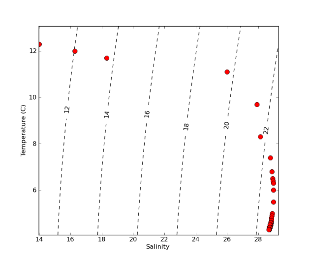
Make a temperature-salinity (TS) diagram from a CTD profile. TS diagrams show density isolines as reference and are useful to identify different water masses.
This example follows the simple tutorial on how to Plot a CTD profile… and uses the same CTD_profile.csv file.
This tutorial needs the Python Seawater Package (download HERE, or see documentation HERE).
import numpy as np
import seawater.gibbs as gsw
import matplotlib.pyplot as plt

# Extract data from file *********************************
f = open('CTD_profile.csv', 'r')
data = np.genfromtxt(f, delimiter=',')
f.close()

# Create variables with user-friendly names
temp  = data[1:,1]
salt  = data[1:,2]
del(data) # delete "data"... to keep things clean

# Figure out boudaries (mins and maxs)
smin = salt.min() - (0.01 * salt.min())
smax = salt.max() + (0.01 * salt.max())
tmin = temp.min() - (0.1 * temp.max())
tmax = temp.max() + (0.1 * temp.max())

# Calculate how many gridcells we need in the x and y dimensions
xdim = round((smax-smin)/0.1+1,0)
ydim = round((tmax-tmin)+1,0)

# Create empty grid of zeros
dens = np.zeros((ydim,xdim))

# Create temp and salt vectors of appropiate dimensions
ti = np.linspace(1,ydim-1,ydim)+tmin
si = np.linspace(1,xdim-1,xdim)*0.1+smin

# Loop to fill in grid with densities
for j in range(0,int(ydim)):
    for i in range(0, int(xdim)):
        dens[j,i]=gsw.rho(si[i],ti[j],0)

# Substract 1000 to convert to sigma-t
dens = dens - 1000

# Plot data ***********************************************
fig1 = plt.figure()
ax1 = fig1.add_subplot(111)
CS = plt.contour(si,ti,dens, linestyles='dashed', colors='k')
plt.clabel(CS, fontsize=12, inline=1, fmt='%1.0f') # Label every second level

ax1.plot(salt,temp,'or',markersize=9)

ax1.set_xlabel('Salinity')
ax1.set_ylabel('Temperature (C)')


