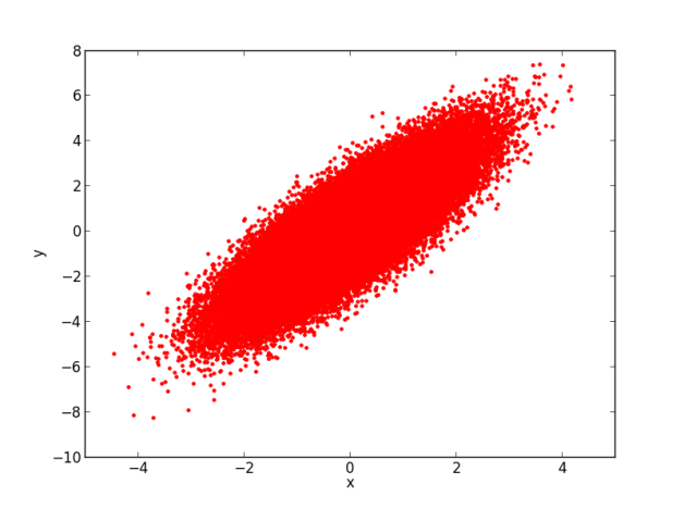
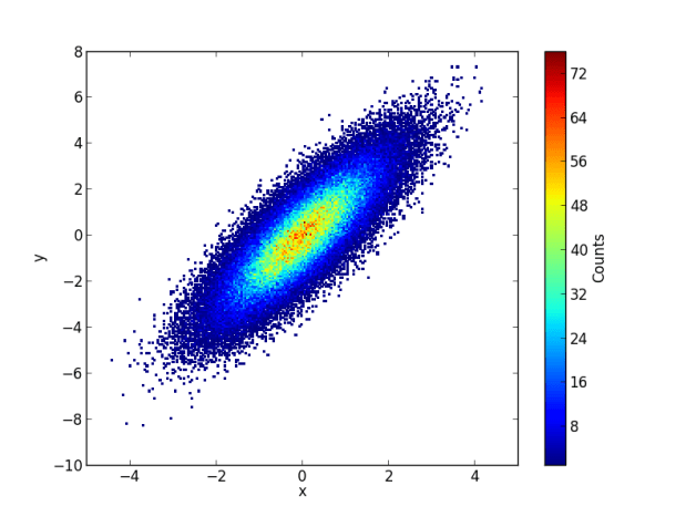
Sometimes there is too much data in a scatter plot. Therefore, it is hard to see if there are “points over points”. In this case, 2D histograms are very useful.
import numpy as np
import matplotlib.pyplot as plt

# Create some random numbers
n = 100000
x = np.random.randn(n)
y = (1.5 * x) + np.random.randn(n)

# Plot data
fig1 = plt.figure()
plt.plot(x,y,'.r')
plt.xlabel('x')
plt.ylabel('y')

# Estimate the 2D histogram
nbins = 200
H, xedges, yedges = np.histogram2d(x,y,bins=nbins)

# H needs to be rotated and flipped
H = np.rot90(H)
H = np.flipud(H)

# Mask zeros
Hmasked = np.ma.masked_where(H==0,H) # Mask pixels with a value of zero

# Plot 2D histogram using pcolor
fig2 = plt.figure()
plt.pcolormesh(xedges,yedges,Hmasked)
plt.xlabel('x')
plt.ylabel('y')
cbar = plt.colorbar()
cbar.ax.set_ylabel('Counts')


Pingback: Plot 2D Histogram of Pixel Values from Two Images | spectraldifferences
This is awesome. I was trying to create 2D histograms that look exactly like this and now I don’t have to use ROOT anymore. They’re beautiful plots.
Why do you have to rotate and flip H?
Yes. Otherwise the plot shows inverted. 🙂
Why they are inverted in default?
Isn’t rotate and flip H exactly the same as transposing H?
If the dimensions for x and y are different and you don’t transpose H, the plot doesn’t show at all, instead an error appears.
for example:
“Dimensions of H (24, 10) are incompatible with x (25) and/or x (11)”
Am I not getting the point here or is this simply a bug or a lousy implementation?
Hi,
I tried the exact same code here because I wanted my program to do the exact same thing. However, it did not quite make a good image. I wish i could have posted it here. Anyways, so information –
My Y axis goes from 10^(-2) to 10^(3) (Logscale)
My X axis goes from 10^(-5) to 10^(19)(Logscale)
The only other noticeable thing seems to be that my Counts are from 8000 – 64000.
Please help. I would be really grateful. 🙂