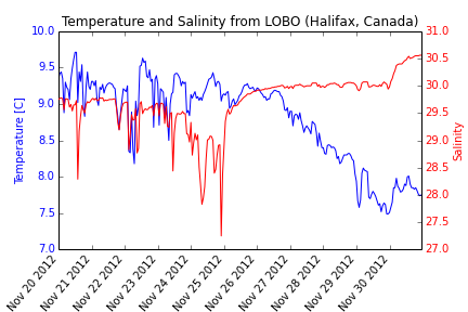
Here we will make a plot using 2 different dependent variables with different scales. Satlantic LOBO is a ocean observatory moored in the North West Arm (Halifax, Nova Scotia, Canada). In this post, we’ll query the LOBO server to create a temperature and salinity plot.
import urllib2
import StringIO
import csv
import matplotlib.pyplot as plt

#define start and end dates
startdate = '20121120'
enddate = '20121130'

# Read data from LOBO
response = urllib2.urlopen('http://lobo.satlantic.com/cgi-data/nph-data.cgi?min_date='
+startdate+'&max_date='+enddate+'&y=salinity,temperature')
data = response.read()

# We use StringIO to convert data into a StringIO object
# Learn more: http://docs.python.org/2/library/stringio.html
data = StringIO.StringIO(data)

# read the StringIO object as it was a file
r = csv.DictReader(data,
dialect=csv.Sniffer().sniff(data.read(1000)))
data.seek(0)

# Put the values into x, y1, and y2.
date= []
temp= []
salt= []
for row in r:
    date.append(row['date [AST]'])
    temp.append(row['temperature [C]'])
    salt.append(row['salinity'])

# Change the time strings into datetime objects
from datetime import datetime
DAT = []

for row in date:
    DAT.append(datetime.strptime(row,"%Y-%m-%d %H:%M:%S"))

#create figure
fig, ax =plt.subplots(1)
# Plot y1 vs x in blue on the left vertical axis.
plt.xlabel("Date [AST]")
plt.ylabel("Temperature [C]", color="b")
plt.tick_params(axis="y", labelcolor="b")
plt.plot(DAT, temp, "b-", linewidth=1)
plt.title("Temperature and Salinity from LOBO (Halifax, Canada)")
fig.autofmt_xdate(rotation=50)

# Plot y2 vs x in red on the right vertical axis.
plt.twinx()
plt.ylabel("Salinity", color="r")
plt.tick_params(axis="y", labelcolor="r")
plt.plot(DAT, salt, "r-", linewidth=1)

plt.show()
#To save your graph
plt.savefig('saltandtemp.png')
